

二维点云上的FastICA
此示例在特征空间中用两种不同的成分分析技术直观地说明了通过结果进行比较的方法。
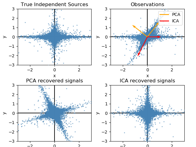
Independent component analysis (ICA) vs Principal component analysis (PCA).
表示ICA的特征空间给出了几何ICA的观点:ICA是一种在特征空间中寻找与高度非高斯投影对应的方向的算法。这些方向在原始特征空间中不需要是正交的,但在白化特征空间中是正交的,其中所有方向都对应于相同的方差。
另一方面,PCA在原始特征空间中寻找对应于最大方差方向的正交方向。
在这里,我们使用高度非高斯过程模拟独立的源,低自由度的学生T(左上角图)。我们将它们混合起来创建观察结果(右上图)。在这个原始观测空间中,PCA识别的方向用橙色矢量表示。我们在PCA空间中用与PCA向量对应的方差(左下角)对信号进行白化处理后,将信号表示在PCA空间中。运行ICA对应于在这个空间中找到一个旋转,以识别最大非高斯(右下角)的方向。
print(__doc__)

# Authors: Alexandre Gramfort, Gael Varoquaux
# License: BSD 3 clause

import numpy as np
import matplotlib.pyplot as plt

from sklearn.decomposition import PCA, FastICA

# #############################################################################
# Generate sample data
rng = np.random.RandomState(42)
S = rng.standard_t(1.5, size=(20000, 2))
S[:, 0] *= 2.

# Mix data
A = np.array([[1, 1], [0, 2]])  # Mixing matrix

X = np.dot(S, A.T)  # Generate observations

pca = PCA()
S_pca_ = pca.fit(X).transform(X)

ica = FastICA(random_state=rng)
S_ica_ = ica.fit(X).transform(X)  # Estimate the sources

S_ica_ /= S_ica_.std(axis=0)


# #############################################################################
# Plot results

def plot_samples(S, axis_list=None):
    plt.scatter(S[:, 0], S[:, 1], s=2, marker='o', zorder=10,
                color='steelblue', alpha=0.5)
    if axis_list is not None:
        colors = ['orange', 'red']
        for color, axis in zip(colors, axis_list):
            axis /= axis.std()
            x_axis, y_axis = axis
            # Trick to get legend to work
            plt.plot(0.1 * x_axis, 0.1 * y_axis, linewidth=2, color=color)
            plt.quiver(0, 0, x_axis, y_axis, zorder=11, width=0.01, scale=6,
                       color=color)

    plt.hlines(0, -3, 3)
    plt.vlines(0, -3, 3)
    plt.xlim(-3, 3)
    plt.ylim(-3, 3)
    plt.xlabel('x')
    plt.ylabel('y')

plt.figure()
plt.subplot(2, 2, 1)
plot_samples(S / S.std())
plt.title('True Independent Sources')

axis_list = [pca.components_.T, ica.mixing_]
plt.subplot(2, 2, 2)
plot_samples(X / np.std(X), axis_list=axis_list)
legend = plt.legend(['PCA', 'ICA'], loc='upper right')
legend.set_zorder(100)

plt.title('Observations')

plt.subplot(2, 2, 3)
plot_samples(S_pca_ / np.std(S_pca_, axis=0))
plt.title('PCA recovered signals')

plt.subplot(2, 2, 4)
plot_samples(S_ica_ / np.std(S_ica_))
plt.title('ICA recovered signals')

plt.subplots_adjust(0.09, 0.04, 0.94, 0.94, 0.26, 0.36)
plt.show()
脚本的总运行时间:(0分0.474秒)